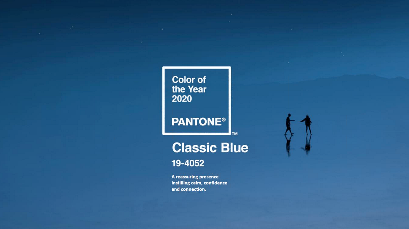
Pantone recently named their color of the year for 2020: Classic Blue. It was a surprising choice to usher in the new decade as we’ve all been used to seeing vibrant, exciting, trendy colors from Pantone to signify each year.
Pantone describes Classic Blue as “a timeless and enduring blue hue . . . elegant in its simplicity. Suggestive of the sky at dusk, the reassuring qualities of the thought-provoking Pantone 19-4052 Classic Blue highlight our desire for a dependable and stable foundation on which to build as we cross the threshold into a new era.”
“It’s a color that anticipates what’s going to happen next,” said Laurie Pressman, the vice president of the Pantone Color Institute, which selects the Color of the Year.
Color is a multi-million dollar business. It’s a major factor in buying-decisions, from home decor to home renovations to automobiles to fashion and more. Pantone’s color of the year is meant to be a reflection of our culture: where we are and where we’re headed. “Manufacturers and product designers can better appeal to consumers by using color trends in their product planning. In fact, on-trend color can increase packaging readership by 40%. Better yet, 85% of customers said color was the number-one reason they picked a product from the shelf.” -Color Marketing
Classic Blue offers dependability, stability, and connection to an era of turmoil. It’s very safe, secure, familiar, and constant. Businesses who are producing products for consumers want to be on trend with colors, and we’ll continue to see classic blue appearing in the market throughout 2020.


